Buyer Persona
In developing the brand strategy for The Concreto Company, a critical step was the creation of detailed buyer personas. These personas were essential for understanding the target audience’s needs, preferences, and behaviors, enabling us to tailor our branding efforts effectively. For this project, we identified two primary buyer personas: Amanda Lee and David Johnson.


Buyer Journey
Understanding the buyer journey was crucial for informing The Concreto Company’s brand strategy. By mapping out the buyer journey stages—awareness, consideration, decision, and post-purchase—we were able to identify key touchpoints and develop strategies to engage our target personas effectively.
The insights gained from the buyer personas and their journeys directly influenced The Concreto Company’s branding decisions. By understanding Amanda’s and David’s motivations, values, and behaviors, we crafted a brand narrative that resonated with their sophisticated and refined tastes. We emphasized the quality, elegance, and authenticity of our products, aligning our marketing messages with the personas’ aspirations and lifestyles. This strategic alignment ensured that The Concreto Company’s branding efforts were targeted, relevant, and effective, ultimately driving engagement and loyalty among our target audience..
Naming Process
Naming is one of the fundamental assets for brands since it works by itself the positioning, proposal, values, and brand architecture. The mission of the brand name is to contextualize the balance between the factors of these three strategies:
A.Behaviour
B.Insight
C.Demography
Throughout my 10 years creating brands, I know that there is no magic recipe that guarantees results, nor is there a single quality for a good name. What matters is the entire vision and understanding that the evaluation process gives us the best chance of having a good result.
I believe it is better to graphically symbolize the criteria that will be considered to have an excellent visual comparison and ensure that the evaluation is mainly perceptual. Still, the comparison of the requirements is rational.
6 topics are considered graded from 0 to 5 to find a balance between the above mentioned criteria.
Naming proposals
The concreto company
Category
Candles
concept
Home & Decor
Meaning
/Evocative
The decomposition of the word “major” alludes to something big.
AVAILABILITY
myor.mx / mjor.mx
Myör ®
Mjör ®
Atera
Category
Candles
concept
Home & Decor
Meaning
/Evocative Name.
This name comes from the Latin “terra,” which means “earth.” It suggests the sustainability and authenticity of the brand.
AVAILABILITY
atera.style / atera.design
atera ®
The Monolite.
Category
Home & Decor
concept
Big Size
Meaning
/Neologism (construction of a new name from existing ones)
“Monochroma” combines “mono,” meaning one, with “chroma,” meaning color, suggesting a focus on simplicity and minimalism. The name also highlights the color options available for the candles, tying into the product itself.
AVAILABILITY
rixla.com / rixla.mx
riXLa ®
Nivana
Category
Candles
concept
Home & Decor
Meaning
A name inspired by the concept of illumination and inner peace, reflecting the calming and soothing effects of candles. The name also has a contemporary and avant-garde vibe, appealing to the company’s target audience.
AVAILABILITY
nivana.store / nivana.life
nivana ®
The Concreto
Company
After a small study conducted with people from the target demographic, The Concreto Company was selected to represent the brand.
Mood board
Brand Voice
POWERFUL – INFLUENTIAL – MEMORABLE
The applications were based on fashion streetwear trends.
Two neutral colors were chosen to adapt to style and fashion more quickly and saturated to a more youthful appearance.
Brand Personality
Stylecapes
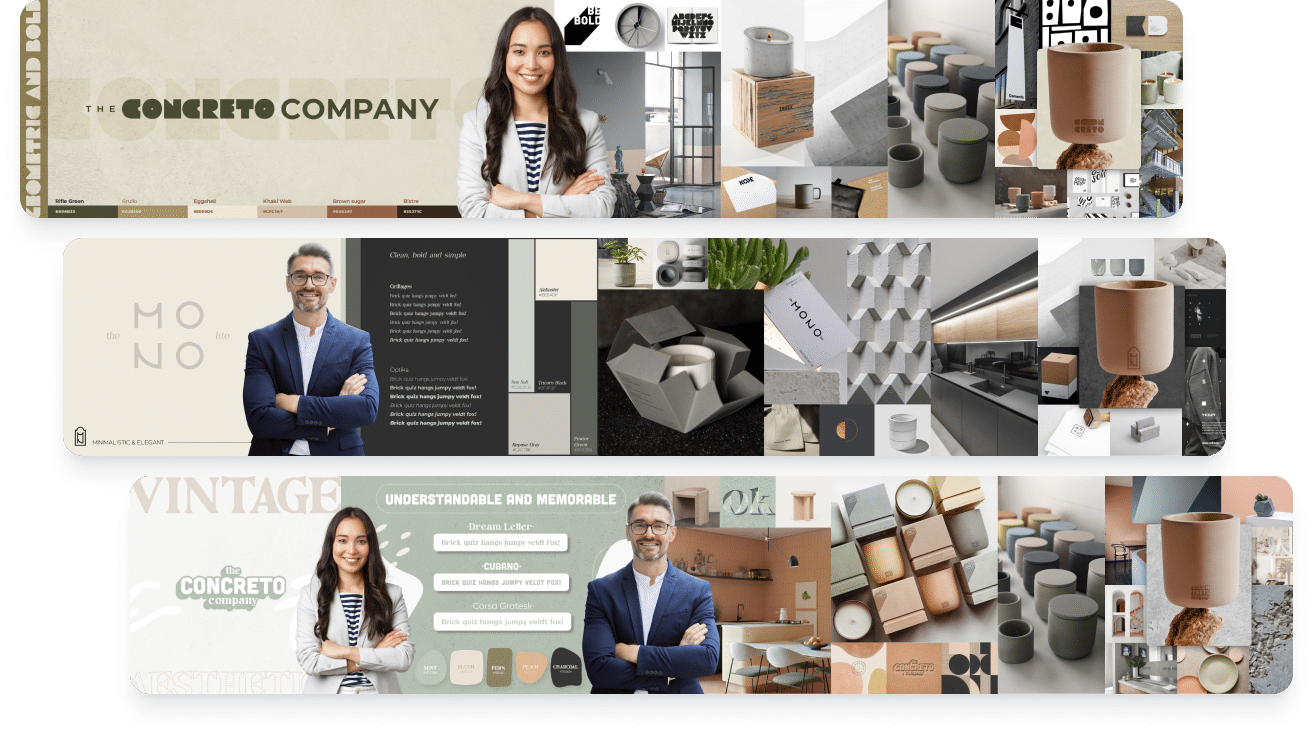
Stylescapes are the bridge between design thinking and visual design.
To translate the insights from our buyer personas into a cohesive visual identity for The Concreto Company, I employed the stylescapes method popularized by Chris Do of The Futur. This approach allowed me to create distinct visual directions that align with the brand’s values and resonate with our target audience. I developed three stylescapes, each embodying a unique set of characteristics.
Logo variations
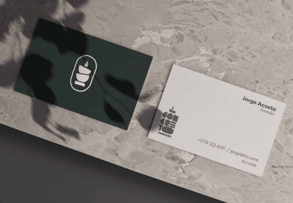
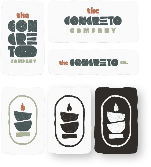
The logotype for The Concreto Company is designed with a strong emphasis on natural elements and rawness, reflecting the brand’s commitment to sustainability and handcrafted products. The letterforms are inspired by the imperfect shapes found in our candles, embodying the uniqueness and individuality of each piece.
The Concreto Company’s icon is inspired by their unique candle products, featuring imperfect bowls and flames. It reflects the handcrafted nature of the candles and our commitment to sustainability and refined aesthetics. The texture and color of concrete reinforces our connection to our core material.
Brand
Guidelines
Ensuring Consistency and Cohesion
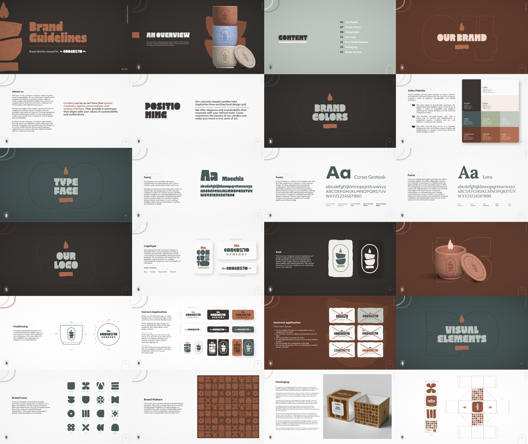
The creation of a comprehensive brand guidelines was a pivotal moment in solidifying The Concreto Company’s visual identity and guaranteeing a steadfast consistency across every touchpoint. Encompassing our brand’s deepest values, visual essence, and voice, these guidelines serve as a guiding light for all our marketing and design endeavors.
